QLIQUID BAR CHART documentation
Installing
Qlik sense desktop:
- 1. Navigate to ..\Users\UserName\Documents\Qlik\Sense\Extensions and create folder qlq-bar
- 2. Сopy all files to new directory from zip file.
- 3. There should be one JavaScript file and one QEXT file
Qlik Enterprise:
- 1. Open Qlik Management Console.
- 2. Select Extensions on the QMC start page or from the Start Arrow down drop-down menu to display the overview.
- 3. Click Create new Import in the top right corner.
- 4. Select qlq-bar.zip to import.
Qlik Cloud:
- 1. In the Management Console, go to the Extensions section and click Add in upper the right-hand corner.
- 2. In the pop-up, click Browse to select an extension file, or drop a file in the designated area.
- 3. Click Publish.
- 4. In the Management Console go to Content Security Policy. Add new one:
Name : as you want to name for ex. QLIQUID
Origin: qliquid.io
Allow: child-src, connect-src, object-src, scrtipt-src
How to update Qlik Sense Extension:
After download of new version just delete old extension and install new depending on your system. All data and settings will be saved.
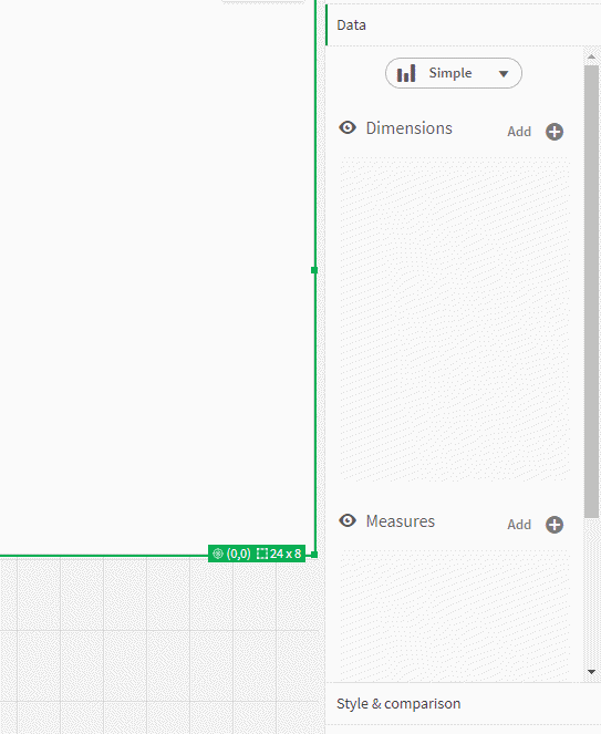
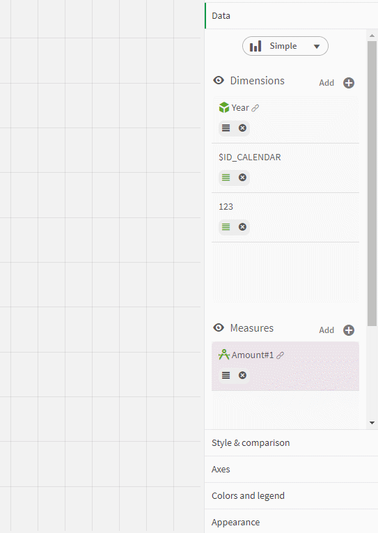
Settings of Data
Data section is in charge of dimensions and measures of the bar chart. You can also set sorting, colors, format and alternative lists.
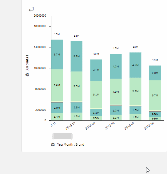
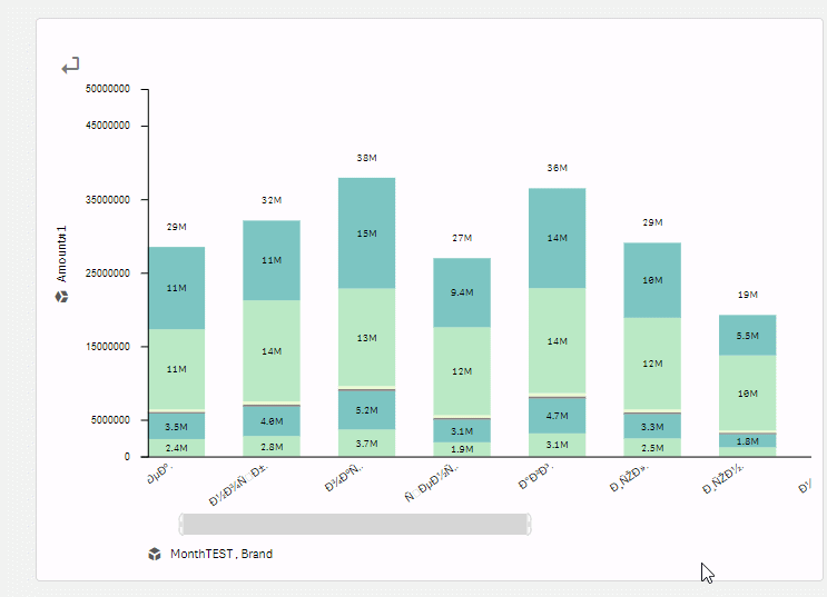
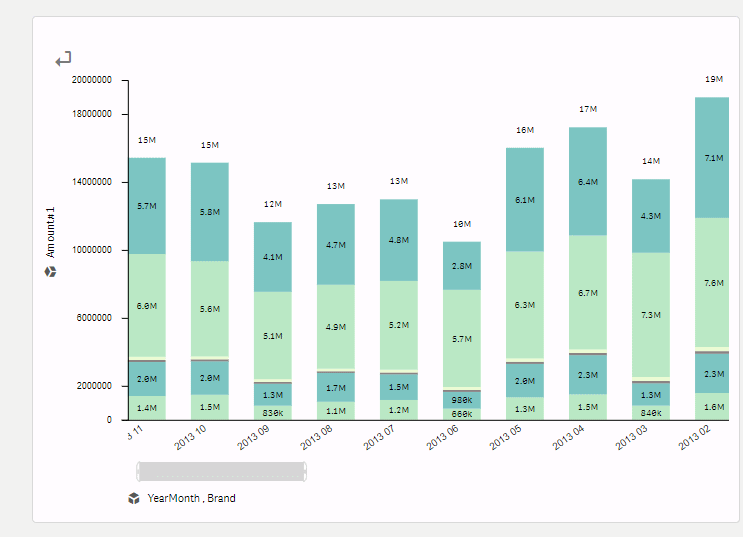
In QLIQUID BAR chart, you can set 3 types of bars:
- 1. Simple - with one dimension and one measure.
- 2. Two dimensions - with two dimension and one measure.
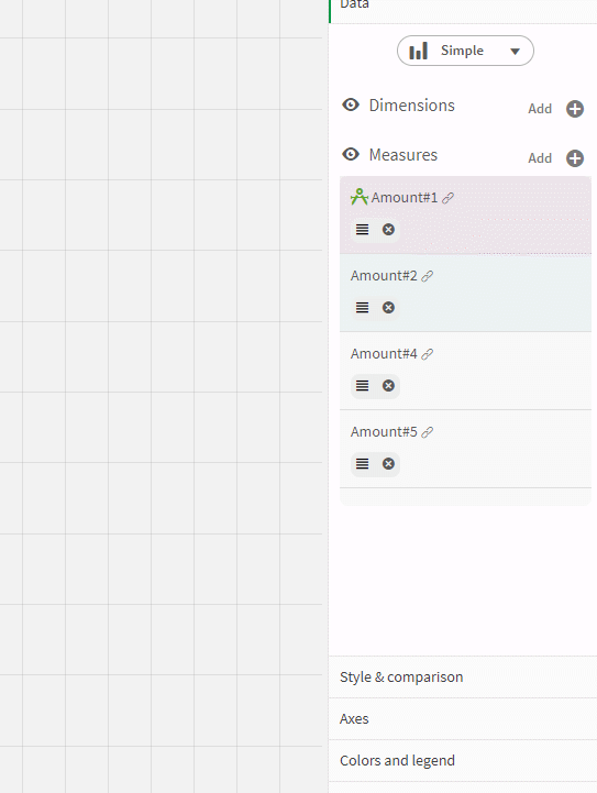
- 3. Multiple measures - with one dimension and multiple measures.
Every time there is a change in the type of chart, a special icon is displayed next to the dimension and measure that will be used.
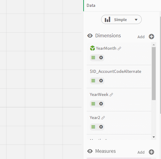 To add a dimension to the list. Click on the add button and choose possible sources:
 - 1. Master dimensions.
- 2. Fields.
- 3. Master visualisation.
- 4. Expression.
Select one of the source and click on the "Add to the list button". As it shown on the picture below.
Drag and drop dimension in the list to make it used for visualisation. Delete or make it used for alternative list on the bottom menu. 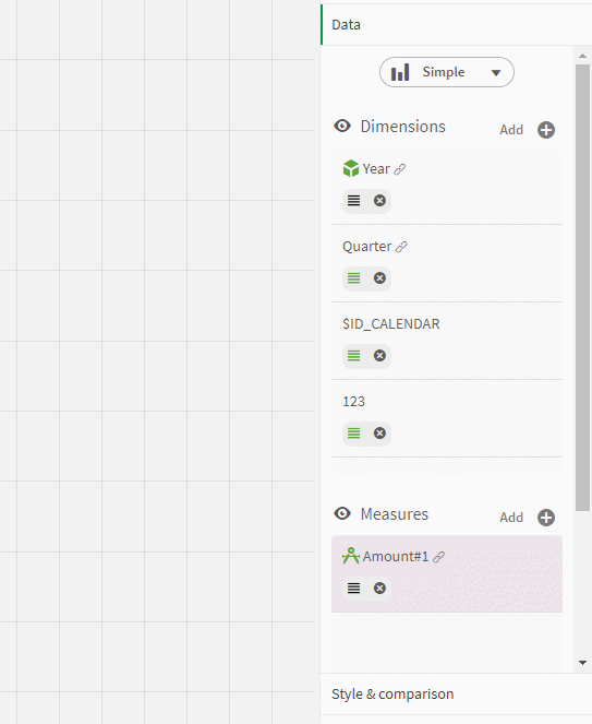
Left click on the dimension to open settings of dimension. There are:
- 1. Alternative list settings. Set it to make the dimension available in alternative list for user.
- 2. Null expression.
- 3. Field and expression settings for no-master dimension.
- 4. Sorting.
 To add a measure to the list. Click on the add button and choose possible sources:
 - 1. Master dimensions.
- 2. Master visualisation.
- 3. Expression.
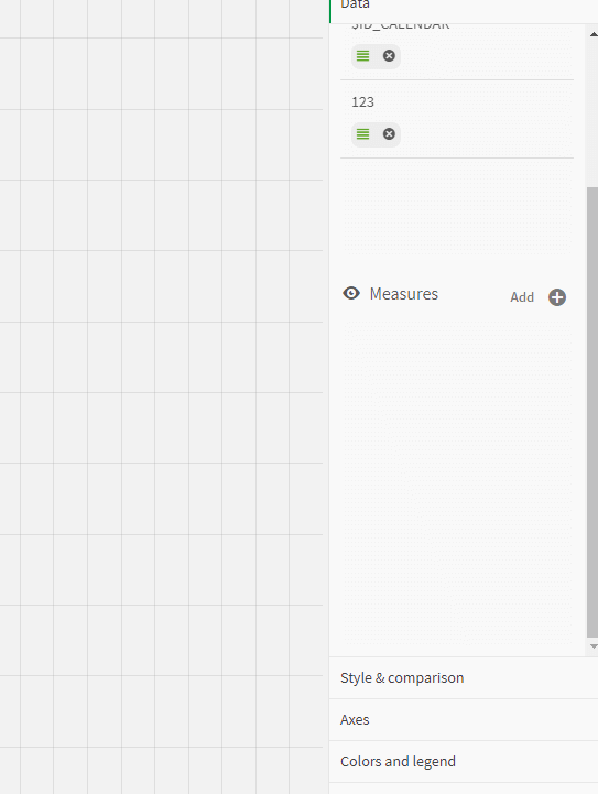
The same as for dimension drag and drop measure in the list to make it used for visualisation. Delete or make it used for alternative list on the bottom menu. 
Left click on the measure to open settings of measure. There are:
- 1. Alternative list settings. Set it to make the measure available in alternative list for user.
- 2. Color. It can be master color or can be set directly.
- 3. Sorting.
- 4. Format.
- 5. Change label and expression for non-master measures.
Settings - style and comparison
Style and comparison section is aimed to set comparison settings and display option of bars and labels.
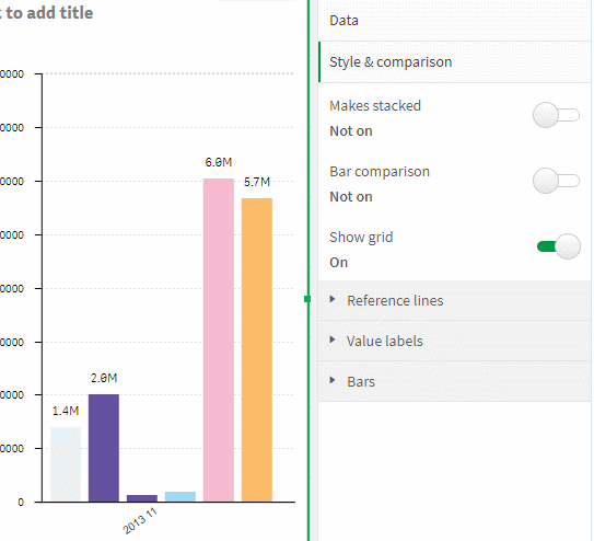
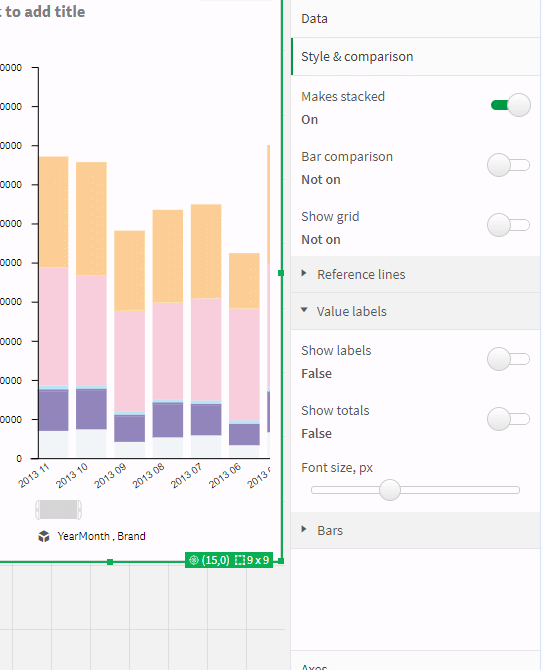
The first switch of the section sets stacked or grouped bar chart. There is no simple bar chart in grouped version, so change to stacked bar chart to use it.
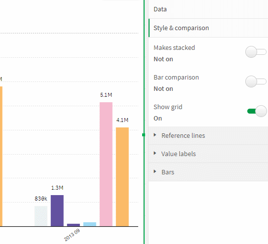
The next option is in charge of showing or hiding the comparison functionality. Stacked bar chart has line comparison, the grouped chart - bar by bar comparison. The usage of that functionality is described below in section "Bar comparison".
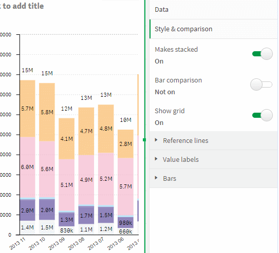
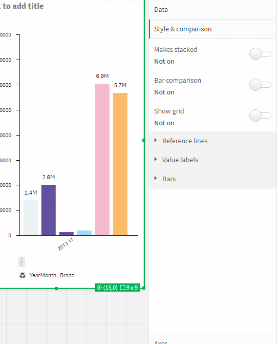
"Show grid" option controls hiding or showing the grid of bar chart.
In reference line section is possible to create a reference lines and set. You can create multiple lines:
- 1. Label - the name of reference line.
- 2. Line value - the value of reference line.
- 3. Show arrows - show compare arrows.
- 4. Line color - the color of line.
- 5. Change color of bar - show overlay for values less then reference line value.
- 6. Overlay color
More about the usage of the reference line is written in the 'Reference Lines' section
In "Value labels" section you can control display of labels and totals values and also its size.
 "Bars" section is in charge of size of bars and its padding.
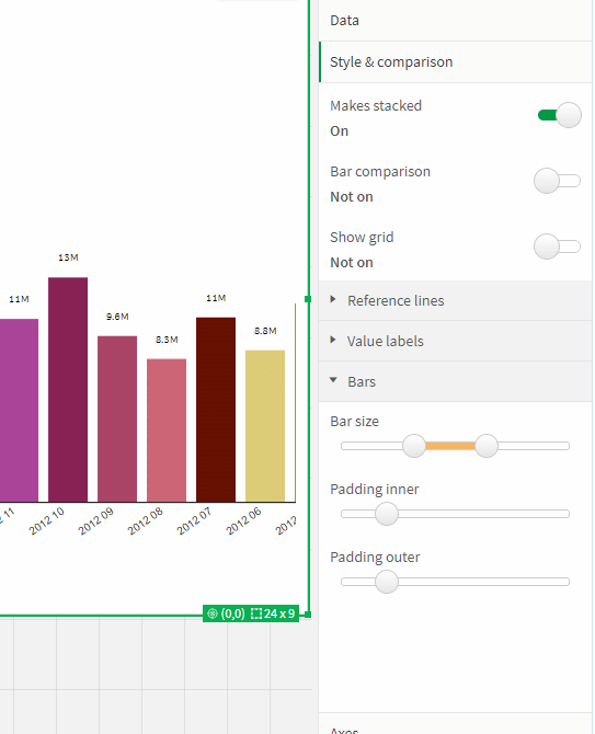
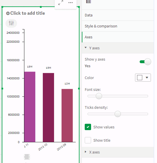
Axes
You can control the display and settings of axis in "Axis" settings.
In "Y axis" section there are:
- 1. Show y axes switch - control display of y-axis
- 2. Color - color of axis ticks and labels.
- 3. Font size - size of ticks labels.
- 4. Ticks density - density of axis ticks.
- 5. Show values - control display ticks and labels
- 6. Show title - control display of title
 In "X axis" section there are:
 - 1. Show y axes switch - control display of x-axis
- 2. Color - color of axis ticks and labels.
- 3. Font size - size of ticks labels.
- 4. Show title - control display of title
- 5. Show values - control display ticks and labels
- 6. Rotate labels - rotate labels to some angle
- 7. Rotate angle - control of rotate angle
- 8. Max percent of height - this setting is applicable for long tick labels.
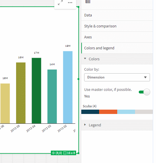
Settings - colors and legend
This section controls the colors and legend of the bar chart. To control the color of a measure, use the settings in the data section for each measure separately.
In color section you can set the type of color:- 1. By dimension - color will bе apply according to master color or selected palette.
- 2. By measure - color will bе apply according to master color or selected color in data section.
"Use master color if possible" control usage of master colors. Master color will have priority over the selected palette, which you can select below.
Usage
Data settings
Users can control data settings through a menu that can be opened with a left click on the x-axis or y-axis.
 In data menu user can change:
 - 1. Stacked or grouped bar chart.
- 2. Type of bar - simple, two-dimensions, multiple-measures
- 3. Change dimensions and measures from alternative list
- 4. Sorting. You can sort by dimension or by measure.
- 5. Color. You can color by dimension or by measure.
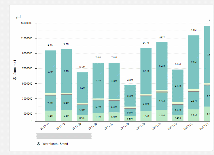
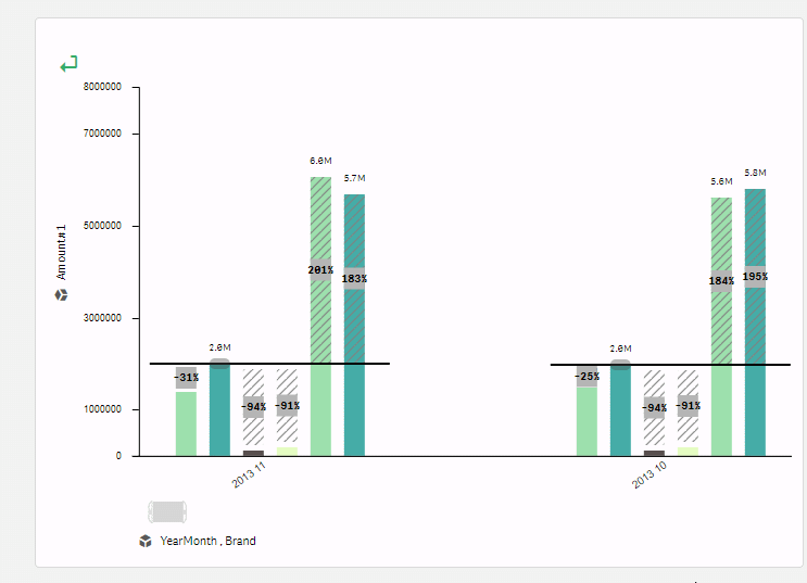
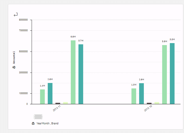
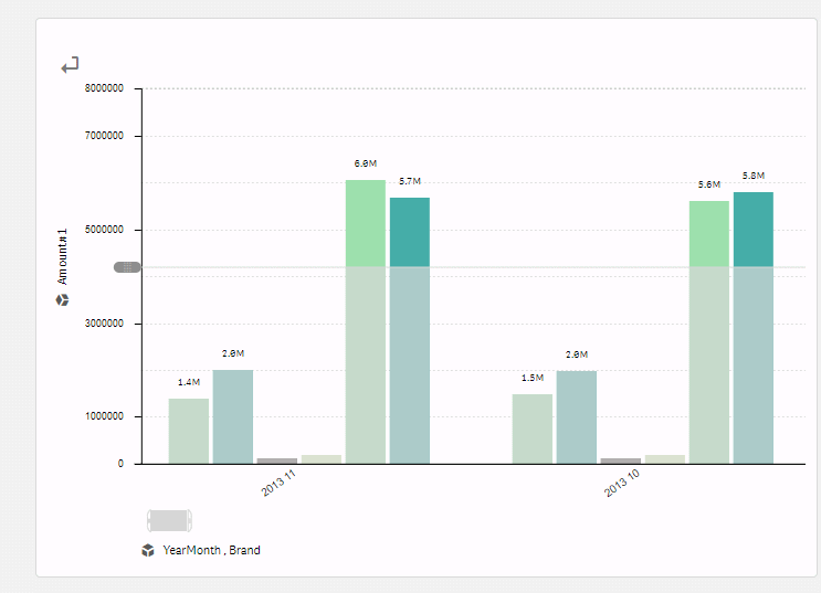
Bar comparison
You can control the display of the comparison functionality using the button at the top left.
There is a line tool for stacked and simple bar charts that compares the total of the bars. You can change the start and end points of the line to see the difference.
There is a bar-by-bar comparison feature for grouped bar charts. You can change the comparison bar by moving the control along the line.
Reference lines
Users can add a reference line to the y-axis by clicking on a special button on the axis. It's possible to create multiple reference lines.
 Users can:
 - 1. Move reference line.
- 2. Delete reference line
- 3. Control display of compare arrows.
- 4. Select values below reference line.
Scroll
Use adaptive scroll to change size and position of the bars.